OTAInfoScreen
Full-screen component for displaying OTA update information, changelog, and manual controls.
Basic Usage
import { OTAInfoScreen } from '@ddedic/expo-fancy-ota-updates';

function SettingsScreen() {
  const navigation = useNavigation();

  return (
    <OTAInfoScreen
      onBack={() => navigation.goBack()}
    />
  );
}
Props
mode
- Type:
'developer' | 'user' - Default:
'developer'
Development mode shows extra debug info (runtime version, update ID, channel). User mode is cleaner and only shows what's relevant to end users.
renderInfo
- Type:
(props: RenderInfoProps) => ReactNode - Required: No
Custom render for the info section (version, date, status).
renderActions
- Type:
(props: RenderActionsProps) => ReactNode - Required: No
Custom render for the actions section (buttons, progress).
renderHeader
- Type:
(props: { theme: OTATheme; onBack?: () => void }) => ReactNode - Required: No
Custom render for the header. Return null to hide the header (useful when a native stack header is already visible).
renderChangelog
- Type:
(props: RenderChangelogProps) => ReactNode - Required: No
Custom render for the changelog list.
Visibility Props
showRuntimeVersion(boolean)showOtaVersion(boolean)showReleaseDate(boolean)showUpdateId(boolean)showCheckButton(boolean)showDownloadButton(boolean)showReloadButton(boolean)showDebugSection(boolean)
onBack
- Type:
() => void - Required: No
Back navigation callback.
style
- Type:
ViewStyle - Required: No
Custom container style.
Modular Sub-Components
You can also import sub-components directly to build your own screen:
import {
  OTAUpdateInfo,
  OTAUpdateActions,
  OTAUpdateChangelog
} from '@ddedic/expo-fancy-ota-updates';
Each sub-component reads state from OTAUpdatesProvider context by default. You can override any value via props:
| Component | Key Props |
|---|---|
OTAUpdateInfo | theme, translations, status, isEmbeddedUpdate, runtimeVersion, otaVersion, otaBuildNumber, otaReleaseDate, currentUpdateId, channel, isUpdateAvailable, lastSkippedReason |
OTAUpdateActions | theme, translations, status, isDownloading, isUpdateAvailable, isDownloaded, isSimulating, checkForUpdate, downloadUpdate, reloadApp, simulateUpdate, resetSimulation |
OTAUpdateChangelog | theme, translations, otaChangelog |
Features
- 📊 Dual Modes — Developer (debug info) vs User (simple view)
- 🧩 Modular Architecture — Use the whole screen or just parts of it
- 🎨 Fully Customizable — Render props for every section
- 📝 Changelog Display — Auto-parsed conventional commits
- 🎮 Simulation Mode — Test update flows with
simulateUpdate() - 🔄 Manual Controls — Check, download, reload with instant feedback
Custom Header
<OTAInfoScreen
  renderHeader={({ onBack, theme }) => (
    <View style={{ backgroundColor: theme.colors.primary }}>
      <TouchableOpacity onPress={onBack}>
        <Text>← Back</Text>
      </TouchableOpacity>
      <Text>My Custom Header</Text>
    </View>
  )}
/>
Example Integration
With Expo Router
// app/settings/ota-updates.tsx
import { OTAInfoScreen } from '@ddedic/expo-fancy-ota-updates';
import { useRouter } from 'expo-router';

export default function OTAUpdatesScreen() {
  const router = useRouter();

  return (
    <OTAInfoScreen
      onBack={() => router.back()}
      showDebugSection={__DEV__}
    />
  );
}
With Expo Router Tabs (Native Header + Internal Header Coordination)
OTAInfoScreen includes its own internal header by default. In tab/stack setups, if you also enable a native stack header, you can end up with double headers or overlapping content.
Recommended pattern:
- In tab screens, keep the native stack header.
- Hide
OTAInfoScreeninternal header in that tab route. - Keep
OTAInfoScreeninternal header for modal/detail routes that passonBack.
✅ Rule of thumb: one route, one visible header source.
// app/(tabs)/(info)/_layout.tsx
import { Stack } from 'expo-router/stack';

export default function InfoLayout() {
  return (
    <Stack>
      <Stack.Screen
        name="index"
        options={{
          title: 'Info Screen',
          headerShown: true,
          headerLargeTitle: false,
        }}
      />
    </Stack>
  );
}// app/(tabs)/(info)/index.tsx
import { OTAInfoScreen } from '@ddedic/expo-fancy-ota-updates';
export default function InfoTabRoute() {
return (
<OTAInfoScreen
mode="user"
// Hide package header when native stack header is visible
renderHeader={() => null}
/>
);
}// app/info-modal.tsx
import { useRouter } from 'expo-router';
import { OTAInfoScreen } from '@ddedic/expo-fancy-ota-updates';
export default function InfoModalRoute() {
const router = useRouter();
return <OTAInfoScreen onBack={() => router.back()} mode="developer" />;
}iOS Native Tabs Compatibility Notes
minimizeBehavioris iOS-version dependent and should be platform/version gated.- Provide a fallback to JS tabs when native tabs behavior is unavailable or unstable for a target iOS range.
- If content appears behind tab bars in custom navigator setups, prefer
contentInsetAdjustmentBehavior="automatic"and ensure bottom padding accounts for tab bar area.
💡 In mixed navigator setups (native tabs + custom content screens), test on at least one older iOS simulator and one latest iOS simulator before release.
With React Navigation
import { OTAInfoScreen } from '@ddedic/expo-fancy-ota-updates';

function OTAScreen({ navigation }) {
  return (
    <OTAInfoScreen
      onBack={() => navigation.goBack()}
    />
  );
}
In Settings Menu
function SettingsScreen() {
  const [showOTA, setShowOTA] = useState(false);

  if (showOTA) {
    return (
      <OTAInfoScreen
        onBack={() => setShowOTA(false)}
      />
    );
  }

  return (
    <View>
      <Button
        title="OTA Updates"
        onPress={() => setShowOTA(true)}
      />
    </View>
  );
}
Screenshot
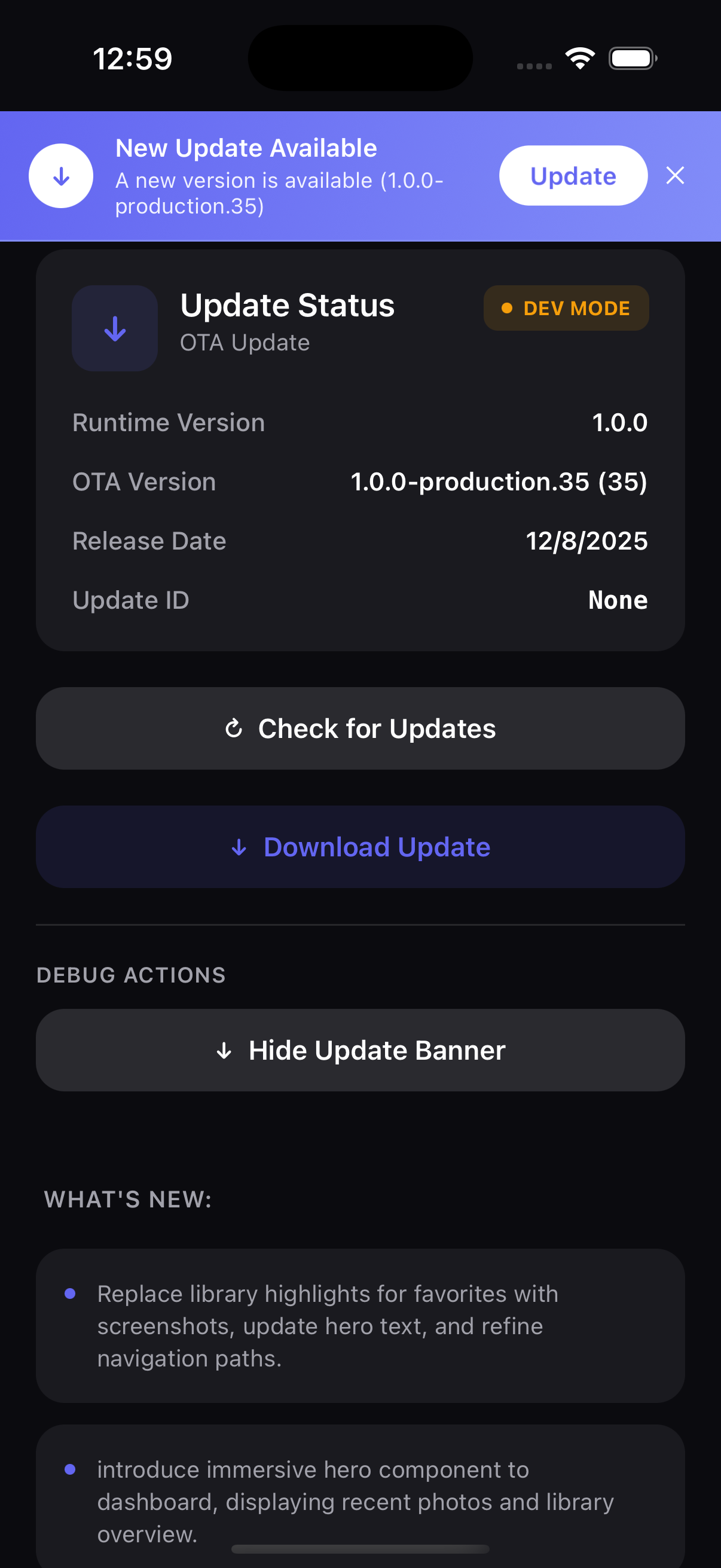
The info screen displays:
- Header — Title and back button
- Status Section — Current update status
- Version Info — Version, build, date, channel
- Changelog — All changelog items
- Actions — Check, download, reload buttons
- Debug (optional) — Technical details
Next Steps
Want to feel the package end-to-end first? Try the Expo Showcase Demo.